Not sure what responsive design means when it comes to digital magazines? You’re definitely not alone so we will cover that very briefly in the next section of this article. Already know what responsive design means? Excellent then read on to learn how and why this applies especially to digital magazines.
Responsive Design for Digital Magazines
If you look up responsive design on Wikipedia you will find the first sentence to read:
Responsive web design (RWD) is an approach to web design aimed at allowing desktop webpages to be viewed in response to the size of the screen or web browser one is viewing with.
In normal people language, this basically means adjusting the contents to fit any device, screen size and orientation. I’m sure you have experienced reading a PDF file on your smartphone, where you have to “pinch to zoom” and “rotate” the page around with your fingers. That is not an ideal way to let your readers consume your content. Definitely not in this day of age!
Why is Responsive Design so Important?
You want to give your readers the best possible experience when consuming your content, so they will come back again and again. This is mainly why responsive content is so important for digital magazine publishers. If the majority of your readers are using smartphones, then you must make sure content looks great on smartphones. Let’s look at some numbers to back this up:
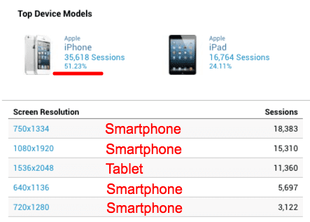
Above data is from our Google Analytics account where we look at native app sessions during September 2017. As you can see, over 51% of all sessions are from iPhones alone where iPads only cover 24% of sessions. The rest is split out on Android devices. If you look at the table you can see the screen resolutions match smartphones for 4 of the top 5 sessions.
Still not convinced? Take a look at your own Google Analytics to see how your traffic is spread out on smartphones Vs. tablets.
MagLoft Supports Responsive Design
When we started building MagLoft back in 2014 we did it with HTML5 content in mind. We did in fact not even support PDF formats for the first 2 years! Because of that HTML5 focus, we have a lot of experience when it comes to responsive design for digital publishers.
We also created our own, drag and drop visual editor, to help our customers create true responsive design. We call this editor TypeLoft and it’s evolving each month. We believe TypeLoft is going to replace tools like Adobe InDesign and other very expensive and complex solutions.
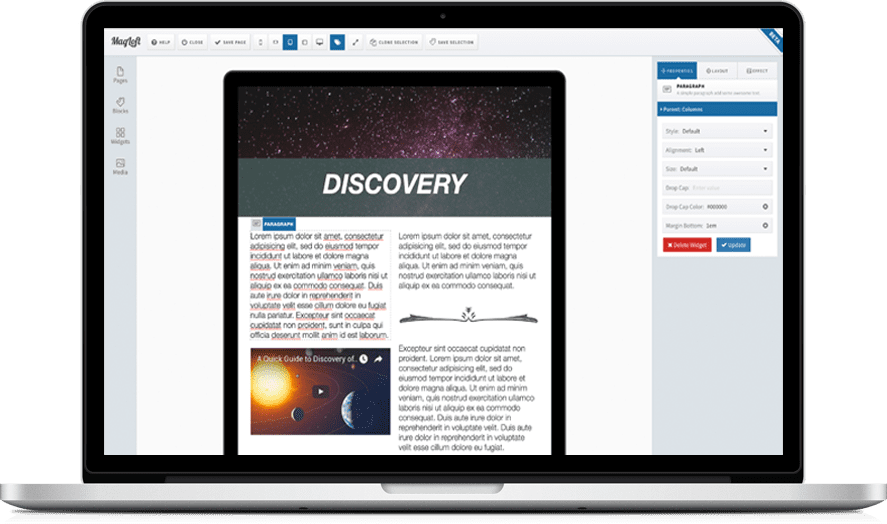
Have a quick look at the video below to see how you can easily switch between different device views and orientations in TypeLoft. You can also see how content automatically re-flows and fits perfectly on any device size and orientation:
Get A Free MagLoft Account Today
It’s free to register for a MagLoft account and you can try out all our tools before you decide to commit. We are committed to making sure that MagLoft is a perfect fit for you. Our amazing support staff is available to take your question live on our website. You have nothing to lose and zero risk by registering for a free account today. Give MagLoft a try, we know you will love it!
Click Here to Register for Free