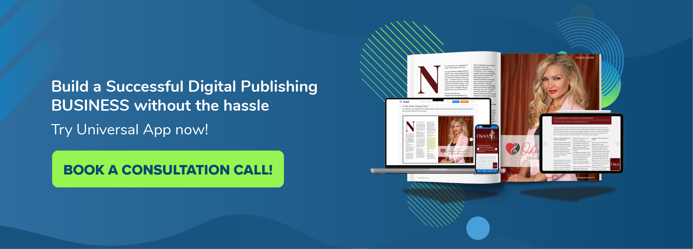
Building your online publication presence requires a lot of time, effort, skill and budget. There are multiple options out there when it comes to building your online presence, like creating a website or using a digital publishing platform.
Before we get into details, it is essential to understand the two styles of website design used by website designers.
Pixel Perfect and Responsive Design, what is the difference?
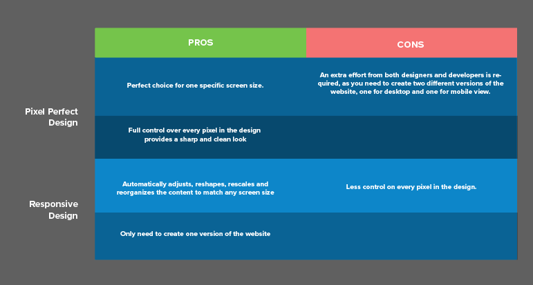
Pixel perfect design means that your website will maintain perfect alignment. The format is precisely controlled, and the website will look identical on different devices, without any changes or adjustments. This consists of line spacing, alignment perfection, typography set, size and much more. Pixel perfect design is frequently used for print media, such as print publications, brochures, and posters.
One example of a pixel perfect design website can be found on http://www.savewalterwhite.com/

Example of Pixel Perfect Design website in full desktop view

The website in a reduced size browser window
Many print publishers have designed their website following a pixel perfect design, providing a great user experience for desktop users. However, with an increasing preference towards mobile devices, these visitors will experience a desktop-resolution website on their smaller phone screen, providing a poor reading experience.
Nowadays, people browse websites from multiple devices, from their desktop, tablet/smartphones, to their smart appliances such as refrigerators. Therefore, it is important to create websites that look great and load quickly.
To meet this challenge, the industry has set a new standard called: “Responsive Design”, which will resolve the issue of multiple devices with different screen resolutions.
Responsive design will automatically adjust, reshape, rescale and reorganize the content to match the screen size.
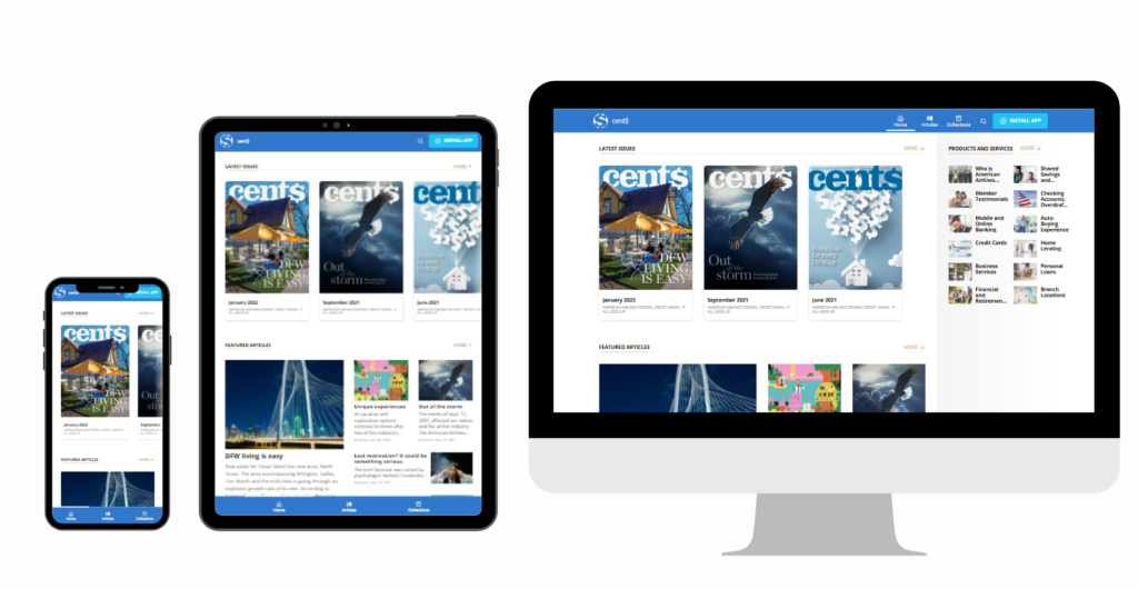
An example of responsive design that adjusts with different screen sizes
Responsive design allows your images, text and layout to automatically fit within any screen size. It prevents the unnecessary resizing, scrolling, zooming or panning that usually happens to websites that have not been optimized for different screen sizes, such as a pixel perfect design website.
Visitors find it difficult to navigate these pages, which frustrates them and may cost you potential customers.
Without responsive design, you would need to create two different versions of a website – one for desktop, one for mobile – which means twice the work, time and money.
Here’s a comparison between Pixel Perfect and Responsive Design:
Can your website be both Pixel Perfect and Responsive?
Pixel perfect and responsive design are quite different, but that doesn’t mean that one is better than the other. Combining the best of both worlds with the perfect ratio is excellent for your website.
One of the recommended approaches to building your website is to start with a particular size that is most used by your visitors. Afterwards, work on the responsive design to cover the remaining screen sizes.
When in doubt, start with optimizing the page for mobile, then expand towards higher resolutions.
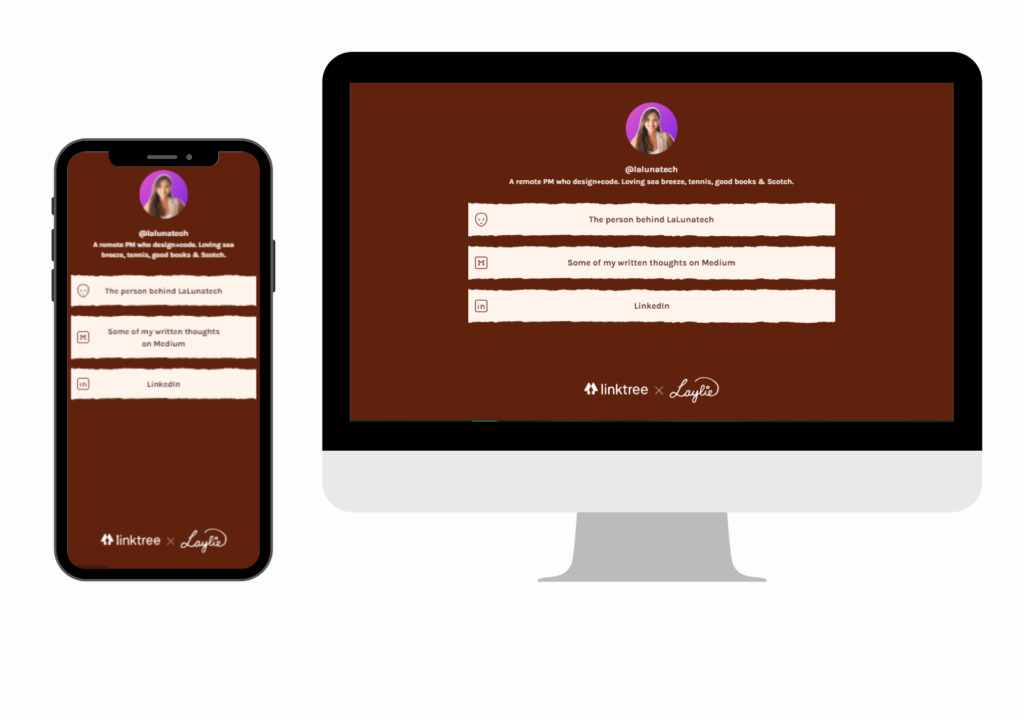
We can see the example here on linktr.ee.
Linktree on both mobile and desktop view
Linktr.ee is a landing page primarily used for social media users or businesses to share multiple links in one landing page. It is designed mainly for mobile users. However, that does not mean that their website is not suitable for desktop viewing.
Because of this, it is unnecessary for linktr.ee to spend more time and effort on perfecting their desktop view, as most of their visitors use mobile.
But, this does not mean that they should neglect the desktop view completely. It is enough as long as the requirements are covered and nothing is broken when visitors visit their page through their desktop.
Example of a good combination of pixel perfect and responsive design
MagLoft’s Universal App is another excellent example of combining pixel perfect and responsive design in an adequate ratio.
MagLoft combines both aspects of pixel perfect and responsive design. Readers can access the publisher’s content in HTML format on multiple devices without zooming in or out to read, thanks to its responsive design implementation.
Pixel perfect design can be found on Universal App’s newest feature, PDF Toggle View.
PDF Toggle View allows readers to switch between the PDF and HTML versions of the content. In PDF Mode, readers can see the exact layout and pixel-perfect nature of the PDF design.
In addition, we automatically choose the best layout for your PDF design. When navigating on landscape orientation, we’ll fit two PDF pages on the screen (i.e. Dual-Spread) to best utilize the available space. As soon as you switch to portrait orientation, we only show a single PDF page to avoid unnecessary gaps.
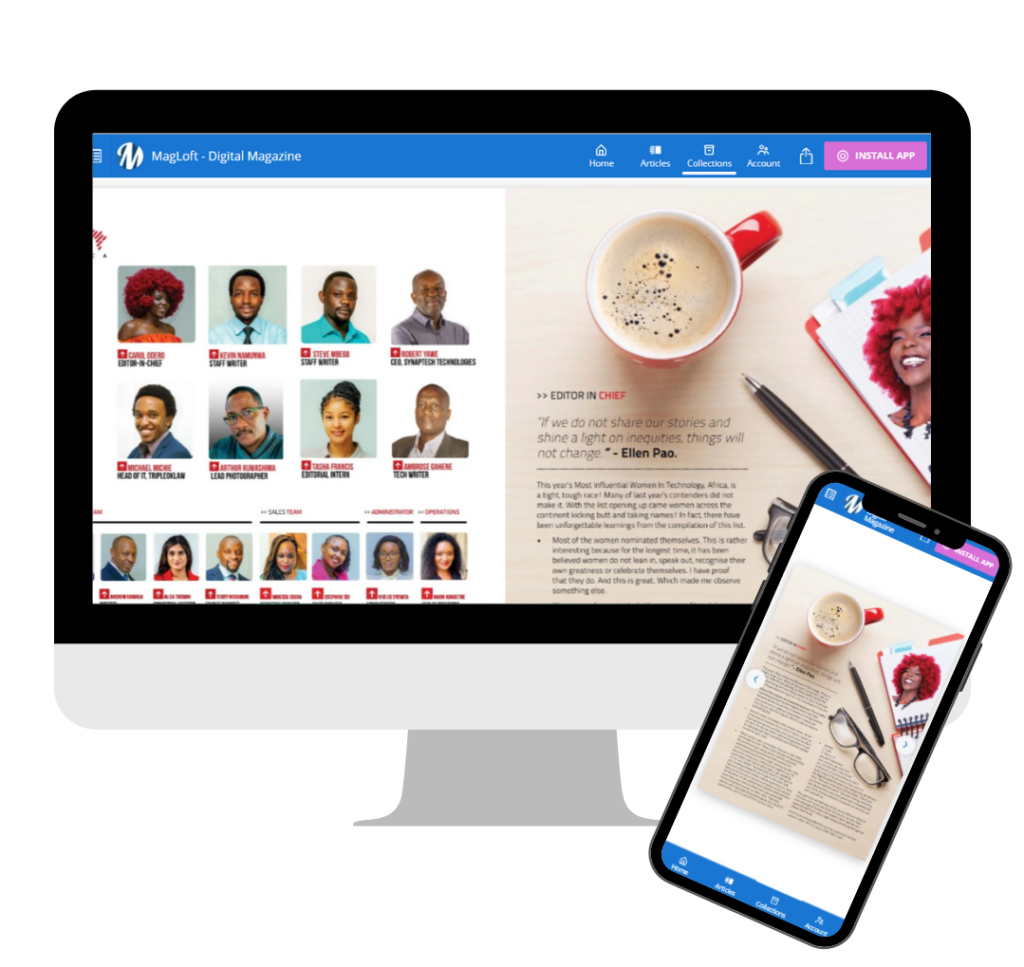
MagLoft PDF Toggle View in both desktop & mobile view
Digital Publishing Solutions VS building a website
Now that you’ve learned the difference between pixel perfect and responsive design, having both on your digital publication is crucial.
By having both, you can provide the best accessibility and experience to your readers. But, if you are still new in either the digital publishing- or web design field, it might be a challenge.
Building your own Website:
Publishing your content on a website built from scratch or using a website builder often lacks a great reading experience.
Websites are tailored to contain a plethora of information spread out into different pages. A standard website consists of the home-, about-, blog- and contact page. Which might be simple enough but doesn’t provide a straightforward path on how to navigate through the content. This might confuse your readers and affect their reading experience.
Websites aren’t easy to create
Even if you are knowledgeable in design and coding, creating a website would still take a lot of time and resources to develop. On average, it takes 3-4 weeks to finish a standard website, so when your goal is to showcase your publication, is it worth it?
The same applies if you are using a Content Management System (CMS) such as WordPress. You might be able to install multiple plugins to achieve your needs, but installing too many plugins is not recommended as it might cause some crashes and performance issues on your website.
We are aware of the many website builder options out there that require no coding skills; however, keep in mind that some of these website builders might not meet the requirements of your digital publication.
They often don’t provide features that digital publishing solutions offer, such as:
- The option to compile multiple articles into a single issue.
- CRM integrations that allow you to see a list of all your readers & subscriptions in one click.
- Additional features to capture information about your readers and build relationships, such as an Opt-in form, Push Notifications, and Email.
- Content Unlocking and payment integrations for issues and articles.
An all-in-one digital publishing solution might be a better choice. You will get most of what you need. without having to deal with a complicated website setup, expensive development costs or problems due to incompatible plugins.
Using a Digital Publishing Solution:
Digital Publishing Solutions provide a clear path for readers to browse through your content.
A digital publication leads its readers along a linear path and shows them where their attention should be focused on.
Starting from the homepage, where you can organize and categorize your issues in a visually appealing way. Mimicking the real-life experience of browsing on news-stands or in bookstores. After a reader selects a topic, they can easily `swipe through` additional content. Your visitors will be more engaged and less distracted before they are greeted with your interactive Call to Actions.
With the right platform, your published articles could be on the internet in a matter of hours or days. Digital publishing services have editorial and design tools that are easy to learn and don’t require any coding knowledge.
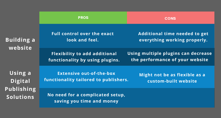
We have summarized the differences between building a website and using a digital publishing solution in the table below:
Conclusion
Having both pixel perfect and responsive design is recommended to provide a good experience to your readers. But it’s difficult to find the perfect balance.
We recommend focusing on responsive design first (i.e. mobile-first approach), and adding a pixel-perfect touch where needed. By this, you can improve the experience on larger screens and desktop devices.
In addition, focus on the features that you need to support your digital publication business. Having an all-in-one solution can significantly reduce setup costs and save you a lot of time in the long run. Submit your form here, to publish your digital publication using an all-in-one digital publishing solution.
Updated on the 5th of October 2023.